Product

Clique Classic Marion S/S 028246

Vaihda tuote
Mx2, Lx1, XLx3
Select Size
minimum quantity: 10 available in bundles of: 10 Product ordered in bundles.
Configure

Suosittu klassikkomalli modernilla mitoituksella. Nappilistassa 3 nappia sävysävyyn. Sivuilla halkiot, kauluksessa ja hihansuissa ribbineulos.

Näytä kuvaus
Piilota kuvaus

Text Properties

Layers


Locations

    All
    Selected
    + Whitebase5
    Search
    Your cart is empty
    Search
     

    Select Size


    Extra Product Options


      Please enter your Layout name


      Select Type Of TekstiSelect Type Of Joukkue nimiSelect Type Of DesignSelect placeholder type

      Hyvät värit, edullinen pienemmissä määrissä. Painatustapa yli 50% polyesterisiin tuotteisiin.
      DTF on kustannustehokas ja kestävä painatustapa 1-100kpl määrissä. Tulostuksessa käytetään CMYK värejä, kaikki RGB kuvien värisävyt eivät ole mahdollisia. Käytössä myös Neon värit Magenta, keltainen, oranssi ja vihreä.
       

      Please enter your teksti


      Select a design

      Please wait while the image gallery loads


      Confirm Request Quote

      You will be redirected to a page where you can request a quote for this blank product. Any decorations you have added to this product will be removed.


      Select Product

      Select Product

        Products


        How many colors are in this design?

        You now have multiple elements making up this screenprint design

        Select the colors that appear in your design.

        You need to specify the total number of unique colors used across all the elements in your design.

        This helps us determine the pricing based on the number of colors in your design.

        • (plus white base)

        You can also specify the colors used in your design eg "Red", "Blue", "pantone 1809".

        If you dont tell us, our professional designer will work it out for you.

        • (plus white base)

        Currently selected Colors


        How many colors are in this design?

        • colored image
        • original image

        How many colors in your design?

        4 Colors

        Select the colors to be used

          COLOR PICKERS GO HERE
         

        Your Cart

        Products Qty Price
        Total €0,00
         

        Re-use existing screen print designs

        You have already used screen printing in this order. To avoid additional screen costs you can re-use an existing screen print design for this product.

        You can

        Re-use existing designs

        or


        WarningError

        Your layout contains images that have been resized to the point where they may appear blurred.

        Below-quality images listed

        Your layout contains images that appear outside the design area.

        You cannot save the product until you have moved the images within the design area.

        Your layout contains images that appear outside the design area.

        Your layout contains overlapping images.

        You cannot save the product until you have moved the images so they are not overlapping.

        Blank product purchase is not allowed

        You will not be able to purchase this product until you add a decoration design.

        Inactive blank product in use

        Minimum quantity requirements not met

        You will not be able to purchase this item until you have increased the quantity.

        Screen(s) still updating...

        You will not be able to purchase this item until all re-used screens have been updated.

        Your layout contains images that have been resized to meet the 25 megapixel limit for raster images and they may appear smaller than intended. You can avoid the raster size limit by uploading artwork in vector format when possible.

        By clicking OK, you are agreeing to accept the final product regardless of image quality. Click Cancel if you want to go back and fix the images.


        Add Joukkue nimi


        Edit Joukkue nimet.

        Add Another Joukkue nimi
         

        Uploading file


        Suunnitteluohjelman ohje 

        Suunnitteluohjelma on helppokäyttöinen työkalu, jonka avulla voit suunnitella oman tuotteen. Voit valita tuotteen koristeltavaksi valmiilla kuviolla, omilla kuvioilla tai valokuvilla ja tekstillä.

        Valitun tuotteen muuttaminen:

        1. Klikkaa Vaihda tuote nappia Product/Tuote paneelissa.
          Product Button

          Valitse tuote -ponnahdusikkuna tulee näkyviin.
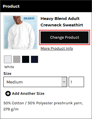
          Product Details Panel.png
        2. Valitse tuote napsauttamalla sitä.

        Tekstin lisääminen tuotteeseen:

        1. Napsauta Lisää teksti -painiketta suunnittelutyökalupalkissa.
          Add Text Button
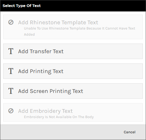
        2. Valiltse käytettävä yksilöintitapa tekstille Select Type of Teksti ponnahdusikkunasta. Vain yksilöitävän tuotteen tukemat vaihtoehdot tulevat näkyviin.
          Select Type Of Text Popup
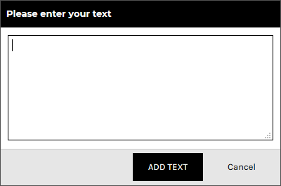
        3. Lisää teksti ja napsauta ADD TEKSTI.
          Please Enter Your Text Popup

          Teksti näkyy koristusalueen sisällä sen rajauslaatikossa, jossa on muokattavissa oleva kokomitta, koon muuttaminen ja kiertäminen kahvoihin ja käytettävissä oleva ohjausobjekti. HUOM! Mitat ei välttämättä vastaa tuotteeseen tulevan printin kokoa, mitat katsotaan tarkemmin tuotannossa, jotta näyttäisi mahdollisimman samalle kuin kuvassa tuotteen yksilöinti mahdollisuuksien rajoissa.
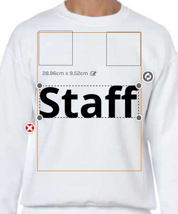
        4. Inserted Text

        Teksti valintojen muokkaaminen:

        1. Klikkaa View and organize layers nappia työkaluriviltä.
          View And Organize Layers Button
        2. Klikkaa teksti objektia, jota halua muokata.

          Text Properties valikko ilmestyy vasemmalle puolelle.
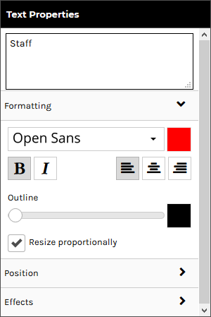
          Text Properties Panel
        3. Muokkaa tekstiä toiveidesi mukaan:

          Formatting

          Formatting tab on avattuna oletuksena ja sisältää seuraavat säätimet:

          Position and Size / Sijainti ja koko

          Napsauta Sijainti-välilehteä laajentaaksesi sitä. Sijainti-välilehden laajentaminen paljastaa seuraavat säätimet:
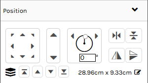
          Position Controls

          Effects/Tehosteet
          Tehosteet ovat saatavilla vain tietyillä yksilöintitavoilla.

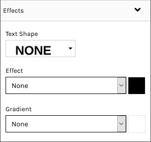
          Klikkaa Effects/Tehosteet-välilehteä laajentaaksesi sitä. Tehosteet-välilehden laajentaminen paljastaa seuraavat tekstitehosteet:
           

          • Teksti ikkuna: Voit muokata tekstiä.
          • Fontti: Muuta fonttia valintaikkunasta, Open Sans oletuksena.
          • Fontin väri: Fontin vieressä on värin valintaikkuna.
          • Bold: Paksuntaa tekstin.
          • Italics: Kursivoi tekstin.
          • Left-align: Tasaa tekstin vasemmalle, kun se kattaa useita rivejä.
          • Center-align: Tasaa tekstin keskelle, kun se kattaa useita rivejä.
          • Right-align: Tasaa tekstin oikealle, kun se kattaa useita rivejä.
          • Outline: Voit lisätä tekstiin ääriviivat. Liukusäätimen vasemmanpuoleisessa kohdassa teksti on ilman ääriviivaa. Liukusäätimen siirtäminen oikealle ottaa käyttöön ääriviivan, jonka paksuus kasvaa mitä pidemmälle oikealle sitä siirretään.
          • Outline Color: Ääriviivan värin valintaikkuna.
          • Resize Proportionally: Kun tämä valintaruutu on valittuna, teksti säilyttää alkuperäiset mittasuhteensa, kun muutat sen kokoa
          • Position controls: voit siirtää valittua tekstiä koriste-alueella millä tahansa kahdeksasta suuntanuolesta.
          • Size controls: voit suurentaa/pienentää valitun tekstin kokoa napsauttamalla ylös/alas-nuolia.
          • Rotation controls: voit kääntää valitun tekstin sen keskiakselin ympäri. Voit tehdä tämän seuraavasti:
            • Tietyn kulman määrittäminen, jossa tekstiä kierretään.
            • Napsauta vasenta nuolta kääntääksesi tekstiä 5 astetta vasemmalle.
            • Napsauta oikeaa nuolta kääntääksesi tekstiä 5 astetta oikealle.
          • Horizontal Centering controls: Keskittää valitun tekstin vaakasuunnassa painatusalueelle.
          • Vertical Centering controls: Keskittää valitun tekstin pystysuoraan painatusalueelle.
          • Layering controls: voit muuttaa tasoa, johon valittu teksti sijoitetaan suhteessa muihin koristeisiin.
        • Effects Controls
          • Tekstin muoto (Text Shape): voit muuttaa tekstin muotoa. Vaihtoehdot osoittavat muodon..
          • Tehoste (Effect): voit lisätä tekstiin varjon tai hehkun.
            • Ei mitään (None): vaikutusta ei käytetä.
            • Varjo (Shadow): lisää tekstiin varjon.
              • Poikkeama: voit määrittää sijainnin, jossa varjo siirtyy tekstistä.
              • Sumeus: voit määrittää sumennustehosteen tason, jota käytetään varjossa.
            • Hehku (Glow): näyttää hehkun tekstin ympärillä.
              • Voimakkuus: voit säätää hehkun voimakkuutta.
              • Sumeus: voit määrittää hehkussa käytettävän sumennuksen tason.
            • Tehosteen väri: voit määrittää tehosteen värin väriponnahdusikkunan kautta.
            • Liukuväri (Gradient): määrittää vaaka- tai pystysuoran liukuvärin valitun kirjasinvärin ja liukuvärin välillä.
            • ​​​​​​​Liukuvärin väri (Gradient Color): voit määrittää liukuvärin värin väriponnahdusikkunan kautta.

        ​​​​​​​


        To add a design using the Add Design button:

        1. Click on the Add Design button in the Designer Toolbar.
          Add Design Button
        2. Select the type of process to be used for the design in the Select Type of Design popup. Only options that are supported by the product being decorated will be enabled.
          Select Type Of Design Popup
        3. Browse to and click on the design you want to add in the Select a design popup.
          Select A Design Popup

          You can select designs from the following sources:

          • Upload a new design: Click on Upload Image to upload a design from your device.

            Raster, vector, and embroidery file types are supported in the formats as listed below:

            • Raster (PNG, JPG, JPEG, GIF, TIF)
            • Vector (CDR*, PDF, EPS, PS, SVG, SVGZ)
            • Embroidery (EMB)

            Vector based graphics will have modifiable elements such as text and colors editable on the fly by users.

            *CDR requires the CorelDRAW app to be enabled. When a CDR file is uploaded it will be automatically converted to SVG format so that it can be modified in the Online Designer.

          • Your own previously uploaded design designs: These will appear under the Upload Image button if you have uploaded designs before.
          • Instagram: Click on the Instagram button and enter your credentials to access your Instagram pictures.
          • Facebook: Click on the Facebook button and enter your credentials to access your Facebook pictures.
          • Store Designs: designs exclusive to the store.
          • Stock Designs: Third-party designs available for use in DecoNetwork.
        4. Click SELECT DESIGN.

          The design will appear inside the decoration area in its bounding box with editable size dimension, resize and rotate handles and delete control available.
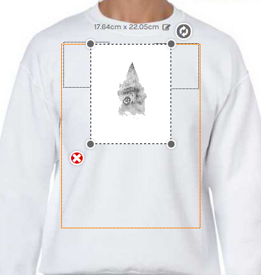
          Inserted Design

        To add a design by drag and drop:

        1. Drag a design file from your computer into the decoration area of the product in the Designer.

          The decoration area will be highlighted when the mouse pointer is within its boundaries.
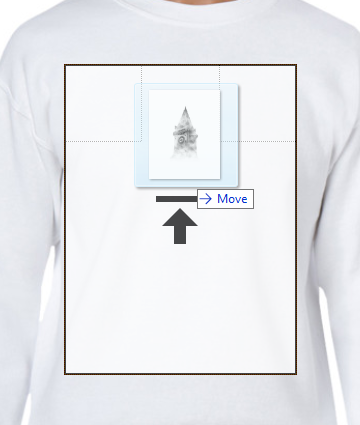
          Highlighted Decoration Area
        2. Release the mouse button to drop the design into the decoration area.

          The Select Type of Design popup will be displayed with the supported decoration types enabled for the product selected.
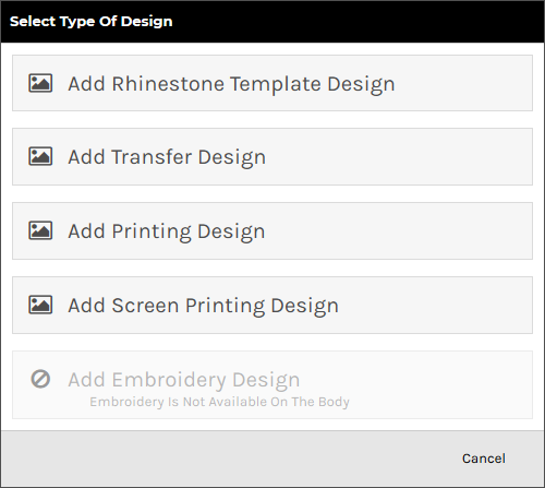
          Select Type Of Design Popup
        3. Select the decoration process you want to be used for the design.

          The system will begin uploading the design file to your own design library.

          Uploading Design.png
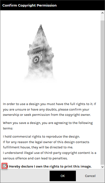
        4. Tick the, I hereby declare I own the rights to print this image, checkbox in the Confirm Copyright Permission popup to verify that you have permission to use the design.
          Confirm Copyright Permission Popup
        5. Click OK.

          The design will appear inside the decoration area in its bounding box with editable size dimension, resize and rotate handles and delete control available.

          Inserted Design

        To adjust design properties:

        1. Click on the View and organize layers button in the View Toolbar.
          View And Organize Layers Button
        2. Click the design object you wish to adjust the properties of.

          The Image Properties panel will appear on the left side of the Designer.
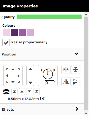
          Image Properties Panel
        3. Configure the design as required:
          • Quality: Shows you a bar indicating how clear the image is for printing. The indicator reflects how well the raster-based graphic is going to print before blurring too badly. If this drops below a certain threshold, the system will warn the customer that their print quality will be compromised.

            This option is only available for raster designs.

          • Colors: Shows you the colors currently used in the design.
            • edit: Click on the link to edit the design colors.

            This option is not available for designs that have restrictions on customizing.

          • Resize Proportionally: when this checkbox is ticked, the design will keep its original proportions when you resize it.

            This option is not available for embroidery, transfer and rhinestone designs.

          • Ungroup: click on the link to ungroup the design into its component elements.

            This option is only available vector-based designs.

          Position

          Click on the Position tab to expand it. Expanding the Position tab reveals the following controls:

          • Position controls: lets you move the selected text within the decoration area using any of the eight directional arrows.
          • Size controls: lets you increase/decrease the size of the selected text by clicking on the up/down arrows.
          • Rotation controls: lets you turn the selected text around its center axis. You can do this by:
            • Specifying a specific angle at which to rotate the text.
            • Clicking on the left arrow to rotate the text 5 degrees to the left.
            • Clicking on the right arrow to rotate the text 5 degrees to the right.
          • Horizontal Centering controls: Horizontally centers the selected text within the decoration area.
          • Vertical Centering controls: Vertically centers the selected text within the decoration area.
          • Layering controls: lets you change the layer at which the selected text is positioned in relation to other decorations.

          Effects

          Click on the Effects tab to expand it. Expanding the Effects tab reveals the following controls:
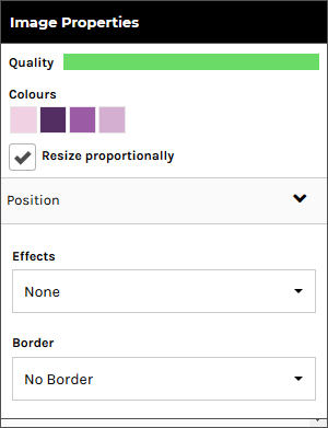
          Image Properties Panel - Effects Section

          These options are only available for raster designs.
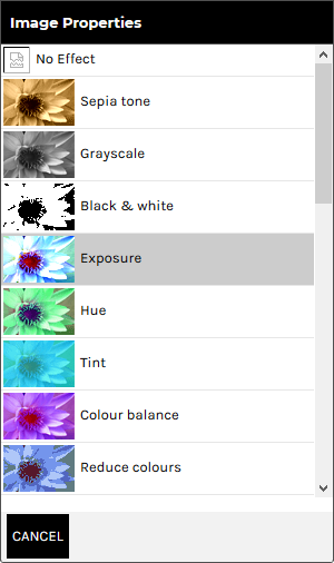
          • Effects: lets you apply a special effect to the design that alters its appearance. Click on the Effects drop-down box to see the effects options.
            Effects Options

            Click CANCEL to return to the Effects Panel.
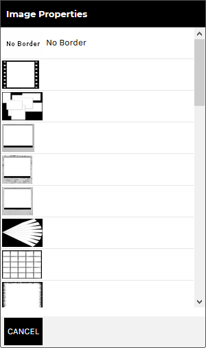
          • Border: lets you apply a border to the boundary of the design. Click on the Borders drop-down box to see the border options.
            Border Options

            Click CANCEL to return to the Borders Panel.


        To specify product sizes and quantities:

        1. Click on the Product button in the Designer Toolbar.
          Product Button

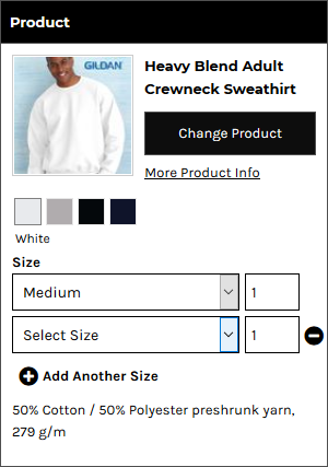
          The Product panel is displayed.

          Product Panel
        2. Select a size from the Size drop-down list and specify the quantity required in the input box for that size.
        3. Click Add Another Size to specify quantities for each size required.
          Another Size Fields

        To specify product size and quantity when products are sold in bulk:

        1. Click on the Product button in the Designer Toolbar.
          Product Button - Bulk Quantity

          The Product panel is displayed.

          Product Details Panel - Bulk Quantity

          The Quantity field will show the minimum quantity you can purchase.

          Note, you can not select multiple sizes when products are sold in bulk.

        2. Select a size from the Size drop-down list in the Product Panel.
          Product Details Panel - Size Dropdown
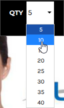
        3. Select a quantity from the QTY drop-down list in the Designer Toolbar.
          QTY Dropdown

        To arrange design layers:

        1. Click on the View and organize layers button in the View Toolbar.
          View And Organize Layers Button

          The Layers panel is displayed showing all the text and design objects present in the decoration area.
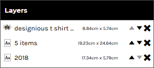
          Layers Panel
        2. Arrange the elements as required:
          • To move a layer up, click on the up arrow to move it to a new position in the list. Likewise, to move a layer down, click on the down to move it to a new position in the list.
          • To delete a layer, click the cross icon at the right of the layer.

        To re-group template design elements:

        You can group elements from a template design that you have ungrouped.

        1. Click on the View and organize layers button in the View Toolbar.
          View And Organize Layers Button

          The Layers panel is displayed showing all the text and design objects present in the decoration area.

          Layers Panel - Ungrouped Elements
        2. Hold down the Ctrl key and click on each layer you want to be grouped.
        3. Click on the Group Selected Items button in the View Toolbar.

        To add team names:

        "Team name" allows automatic formatting of text in the form of a small name and large number beneath, decorated onto the product. This is useful for teams and other groups who would like a jersey-style name and number on their product.

        1. Click on the Add Team name button in the Designer Toolbar.
          Add Team Name Button
        2. Select the decoration process you want to be used for the team names.

          The Add Team name popup will be displayed.

          Add Team Name Popup
        3. Select a size and specify the quantity required for that size.
        4. Click Add Another Size to specify quantities for each size required.
        5. Click Next.

          The Edit Team name popup will be displayed containing Name and Number fields to match the quantities specified in the Add Team name popup.
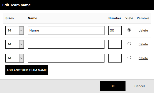
          Edit Team Name Popup
        6. Configure team names by entering the team name and number for each product to be decorated.

          The item selected in the View column will be the item that is displayed in the Designer.

        7. Click Add Another Team Member and specify the team name and number for each additional product required.
        8. Click OK when done.

          The team name and number will be set up on the product as text areas whose properties may be adjusted as per normal text, except that any changes made will apply to all team name products.
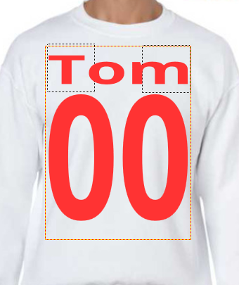
          Team Name On Product

          See the section, To adjust the properties of text in the Designer, above, for details on how to adjust the formatting, adjust the position and apply effects to the text fields.

        9. If you want to edit the teamnames and numbers, select a text area and click Edit teamnames in the Text Properties panel to display the Edit Team name popup.
        by